

Here's the uncomfortable truth: that "bold" text isn't actually bold. It's Unicode character substitution, and it's quietly destroying your accessibility, tanking your SEO, and making your content invisible to a significant portion of your potential audience.
This problem affects every major social media platform. Let me explain why you should stop using these tools immediately - and for X.com users, I'll show you a proper solution.
But even with a paid X.com subscription, all formatting is stripped when you paste text. If you draft a post in Google Docs, Notion, or Word with careful bold and italic styling, it all disappears the moment you paste it into X.com. You're forced to manually re-select each word and reapply formatting—tedious and error-prone for long posts or threads.
| User Type | Has Native Formatting? | The Catch |
|---|---|---|
| X Premium ($8+/month) | ✅ Yes | Formatting is stripped on paste |
| Free users | ❌ No | No formatting options at all (you need to resort to Unicode hacks) |
What's really happening when you "bold" text with Unicode
When you type "Hello" into a Unicode text formatter and get back "𝗛𝗲𝗹𝗹𝗼", you're not applying formatting. You're replacing the letter "H" (Unicode U+0048) with "𝗛" (Unicode U+1D5D7) - which is technically "Mathematical Sans-Serif Bold Capital H."
These aren't the same characters. They're completely different symbols that happen to look similar to their regular counterparts.
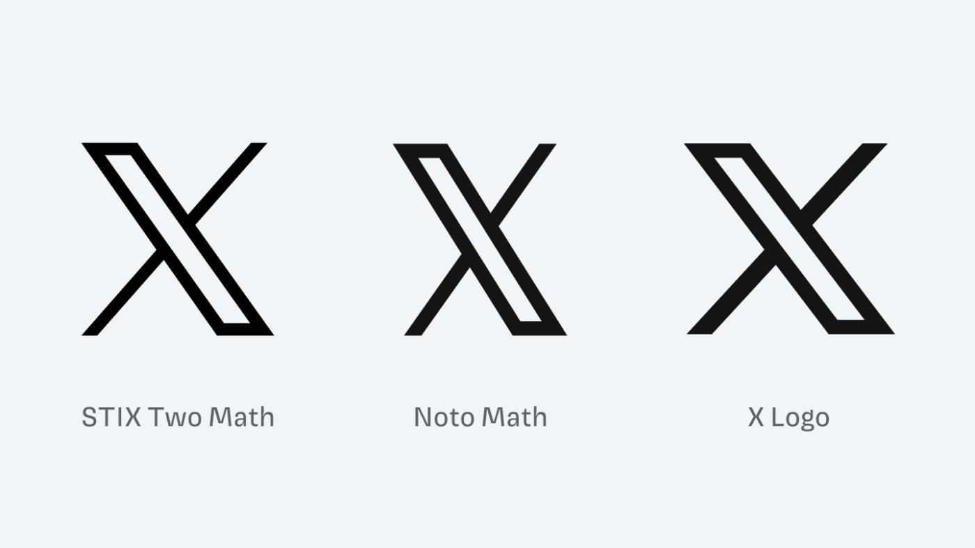
Ironically, the 𝕏 logo itself is a Unicode character (U+1D54F, "Mathematical Double-Struck Capital X"). The platform's own branding uses the same character set that causes accessibility and SEO problems when used in posts.
But this distinction matters enormously, and here's why.
The accessibility disaster
Here's what happens when someone using a screen reader encounters your cleverly formatted post - on any platform:
What you wrote: "Check out our 𝗻𝗲𝘄 product launch!"
What a screen reader says: "Check out our mathematical sans-serif bold small n, mathematical sans-serif bold small e, mathematical sans-serif bold small w product launch!"
You 𝘵𝘩𝘪𝘯𝘬 it's 𝒸𝓊𝓉ℯ to 𝘄𝗿𝗶𝘁𝗲 your tweets and usernames 𝖙𝖍𝖎𝖘 𝖜𝖆𝖞. But have you 𝙡𝙞𝙨𝙩𝙚𝙣𝙚𝙙 to what it 𝘴𝘰𝘶𝘯𝘥𝘴 𝘭𝘪𝘬𝘦 with assistive technologies like 𝓥𝓸𝓲𝓬𝓮𝓞𝓿𝓮𝓻? pic.twitter.com/CywCf1b3Lm
— Kent C. Dodds ⚡ (@kentcdodds) January 9, 2019
Or worse - many screen readers simply go silent. The text becomes completely inaudible, leaving blind and visually impaired users confused about what they just missed.
This isn't a theoretical problem. According to the World Health Organization, approximately 2.2 billion people globally have some form of vision impairment. Many of them rely on assistive technologies to navigate social media - whether that's X.com, LinkedIn, Instagram, Facebook, or any other platform.
When you use Unicode formatting tricks, you're telling these users: "This content isn't for you."
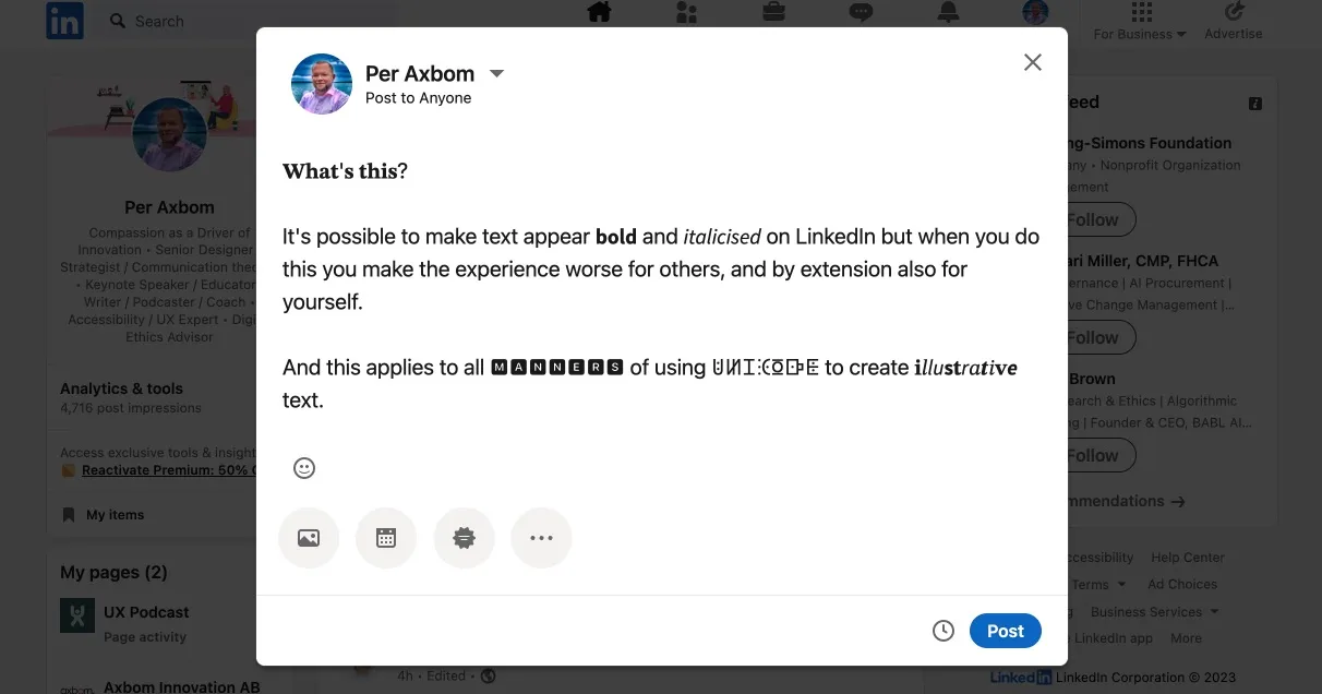
Per Axbom, a respected accessibility advocate, demonstrated this problem extensively in his research. Screen readers either skip Unicode-styled text entirely or read out the mathematical character names one by one - creating an experience that ranges from confusing to genuinely distressing for users with sensory processing sensitivities.
The SEO problem you didn't know you had
Search engines have gotten remarkably good at understanding content - but they still expect text to be text.
When you post "Join our 𝗳𝗿𝗲𝗲 webinar," search algorithms don't see the word "free." They see a string of mathematical symbols that don't match any search queries.
This means:
- Your posts won't appear in platform search results for relevant keywords (X.com, LinkedIn, Instagram, etc.)
- External search engines like Google can't properly index your content
- Your carefully crafted keywords become invisible to discovery algorithms
One SEO study from Sterling Sky found that Unicode characters in web content led to ranking drops, with the cons clearly outweighing any visual benefit.
Think about it: you're putting effort into crafting posts that people literally cannot find.
Copy-paste and translation failures
The problems compound when people try to interact with your content:
- Copy-paste breaks: When someone copies your Unicode text into a document, email, or another platform, the formatting often renders incorrectly or displays as question marks on older devices
- Translation tools fail: Google Translate and other services choke on Unicode-styled text because they don't recognize the characters as language
- Cross-platform display issues: What looks bold on your iPhone might appear as empty boxes on someone's Android device or desktop browser
The irony: you're paying for worse results
Why do people use Unicode formatters in the first place? Because most social media platforms - X.com, LinkedIn, Instagram, Facebook - don't offer native text formatting. X.com does have native bold and italic, but it's exclusively available to X Premium subscribers (starting at around $8/month). Free users don't see the formatting buttons at all.
So people turn to free Unicode tools as a workaround - across all platforms.
But here's the irony: by using Unicode formatting, you're actually getting worse results than plain text. At least plain text is searchable, accessible, and works everywhere.
The right solution: native formatting
The Unicode formatting problem affects all social media platforms. Unfortunately, most platforms (LinkedIn, Instagram, Facebook) don't offer native text formatting at all - so your only real option is plain text.
But X.com is different. X.com actually supports native bold and italic formatting that works properly with screen readers, search engines, and all devices. The catch? It's only available to X Premium subscribers. Free users simply don't have access to the formatting buttons in the composer.
Even with Premium, there's another problem: X.com strips formatting when you paste text. If you've carefully formatted a post in Google Docs, Notion, or anywhere else, the moment you paste it into X.com's composer, all your bold and italic styling disappears. You're forced to manually re-select text and click the B and I buttons to reapply formatting. For long posts or threads, this is tedious and error-prone.
This is exactly the problem Pasterboy solves.

You write your content in your favorite tool - Google Docs, Notion, Word, or plain Markdown - and Pasterboy transfers it to X.com with formatting intact, using the platform's native styling.
Key benefits:
- Formatting survives the paste: Your bold and italic text transfers directly to X.com's composer
- Screen reader compatible: Native formatting reads naturally to assistive technologies
- Fully searchable: Keywords remain keywords, so your posts appear in search results
- Auto-thread splitting: Automatically splits long posts into threads at natural break points
Pasterboy is free to use with 20 posts per month. For more details, visit pasterboy.app or get it on the Chrome Web Store.
The bigger picture: inclusive design isn't optional
This isn't just about SEO or reach metrics. It's about who gets to participate in public conversation.
When we use tools and techniques that exclude people with disabilities, we're making a choice about whose voices matter. We're telling blind users, people with cognitive disabilities, and anyone using assistive technology that our aesthetic preferences outweigh their ability to access information.
Unicode text formatters might seem harmless - just a fun way to make posts stand out on X.com, LinkedIn, or Instagram. But the cumulative effect of millions of inaccessible posts creates a social media environment that's actively hostile to a significant portion of the population.
What you should do now
- Stop using Unicode text formatters. On any platform. Full stop. The visual benefit isn't worth the accessibility and SEO cost.
- For X.com with Premium: Use native formatting - and install Pasterboy so you can paste rich text without losing your formatting.
- For X.com without Premium: Stick with plain text. It's searchable, accessible, and works everywhere - which makes it better than Unicode formatting in every measurable way.
- For LinkedIn, Instagram, Facebook, and other platforms: Plain text is your only accessible option. These platforms don't support native formatting, so Unicode tricks are your only "formatting" option - and as we've established, that's worse than no formatting at all.
- Audit your existing content. If you've posted Unicode-formatted text anywhere, consider reposting important content in accessible form.
- Spread the word. Many people using Unicode formatters have no idea they're creating accessibility barriers. Share this information.
Your posts deserve to be read by everyone. Your keywords deserve to be found. And your audience - all of your audience - deserves to be included.
Tired of losing formatting when you paste into X.com? Check out Pasterboy or get it free on the Chrome Web Store.


