

Publishing a Chrome extension? Your store listing images are the first thing potential users see – and they can make or break your download numbers. A polished, professional presence in the Chrome Web Store builds trust and clearly communicates what your extension does.
Get my Chrome Web Store image template for Adobe Express
In this guide, I'll walk you through every image you need, the exact dimensions required, what copy to include, and design tips to make your extension stand out. Plus, I'm sharing a free Adobe Express template to make the process even easier.
Why your store images matter
The Chrome Web Store is crowded. Users scroll through dozens of extensions, making snap judgments based on visuals alone. Your images need to:
- Grab attention in search results and category pages
- Communicate value in seconds
- Build trust through professional design
- Show functionality with clear screenshots
Google also uses your promotional images when featuring extensions, so high-quality assets can lead to premium placement and significantly more downloads.
Required vs. optional images
Before diving in, let's clarify what's mandatory and what's optional:
| Image type | Dimensions | Required? |
|---|---|---|
| Extension icon | 128×128 px | ✅ Yes |
| Screenshots | 1280×800 px or 640×400 px | ✅ Yes (at least 1) |
| Small promo tile | 440×280 px | ❌ Optional (but recommended) |
| Marquee promo tile | 1400×560 px | ❌ Optional |
My recommendation: create all of them. The optional promotional tiles are used when Google features extensions in the store, and you don't want to miss that opportunity because you skipped an image.
1. Extension icon
This is your extension's identity. It appears in:
- The Chrome toolbar
- The Chrome Web Store listing
- The Extensions management page (chrome://extensions)
- Search results
Dimensions
128×128 pixels (PNG format, 32-bit color with alpha transparency)
You'll also want to create smaller versions for the manifest:
- 16×16 px (favicon size, for toolbar)
- 32×32 px
- 48×48 px (Extensions page)
- 128×128 px (Chrome Web Store)
Design tips
Do:
- Use a simple, recognizable symbol
- Ensure it's legible at 16×16 px
- Use your brand colors consistently
- Consider how it looks on both light and dark browser themes
- Use transparency for non-square designs
Don't:
- Include text (it won't be readable at small sizes)
- Use photographs
- Make it too detailed or cluttered
- Copy existing popular extension icons
Copy
None – icons should be purely visual. If you need to include a letter or symbol, make it bold and simple.
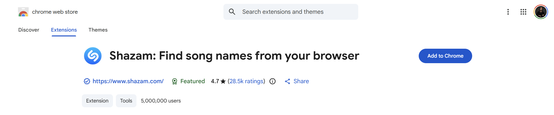
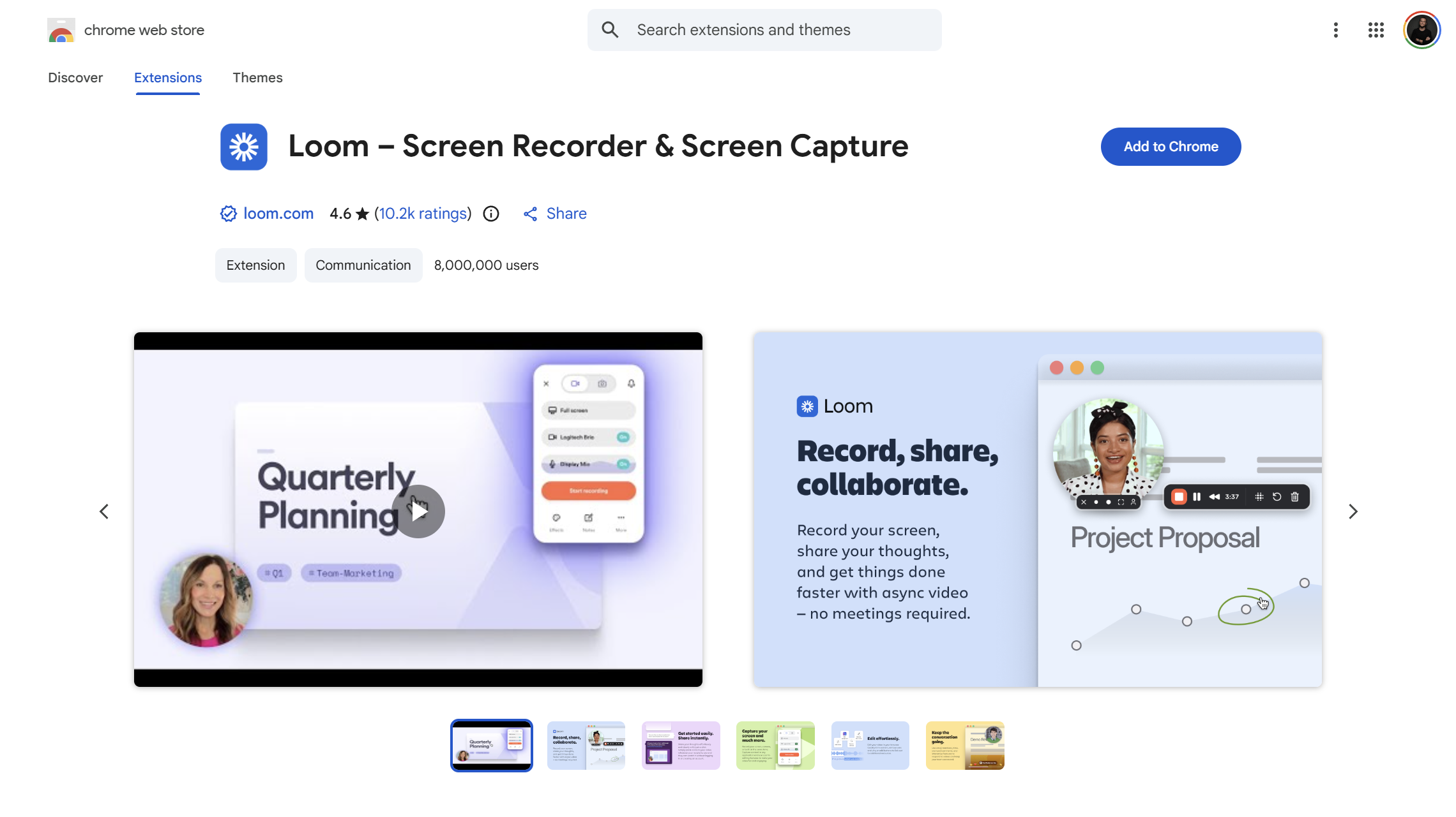
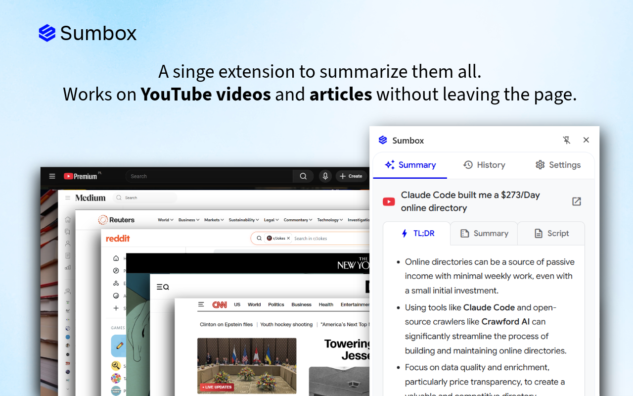
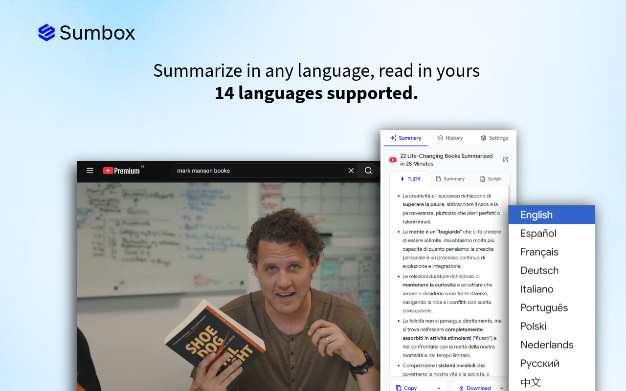
2. Screenshots
Screenshots show users exactly what they're getting. They appear in your store listing's image carousel and are often the deciding factor for downloads.
Dimensions
- Recommended: 1280×800 pixels (16:10 aspect ratio)
- Minimum: 640×400 pixels
- Maximum: 5 screenshots allowed
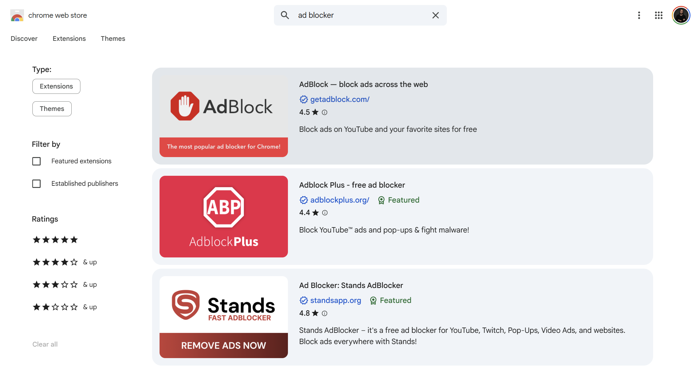
Screenshot examples
What to capture
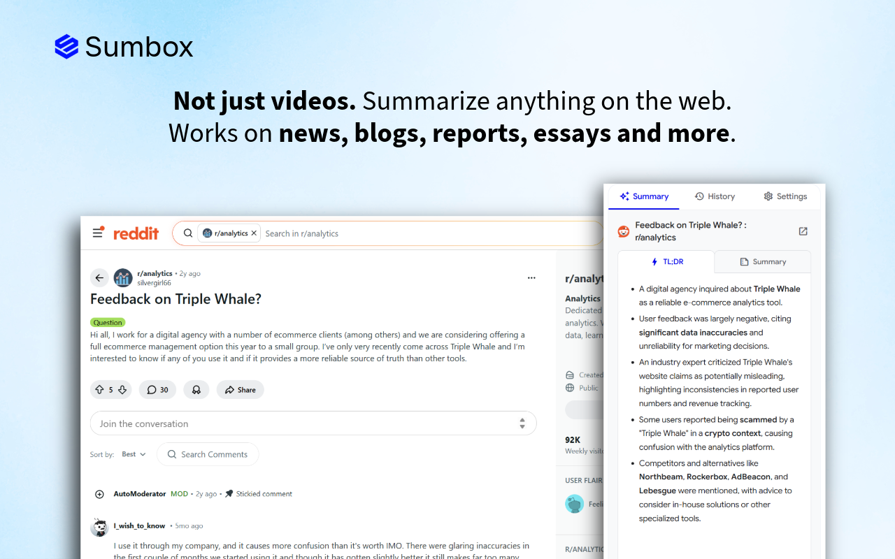
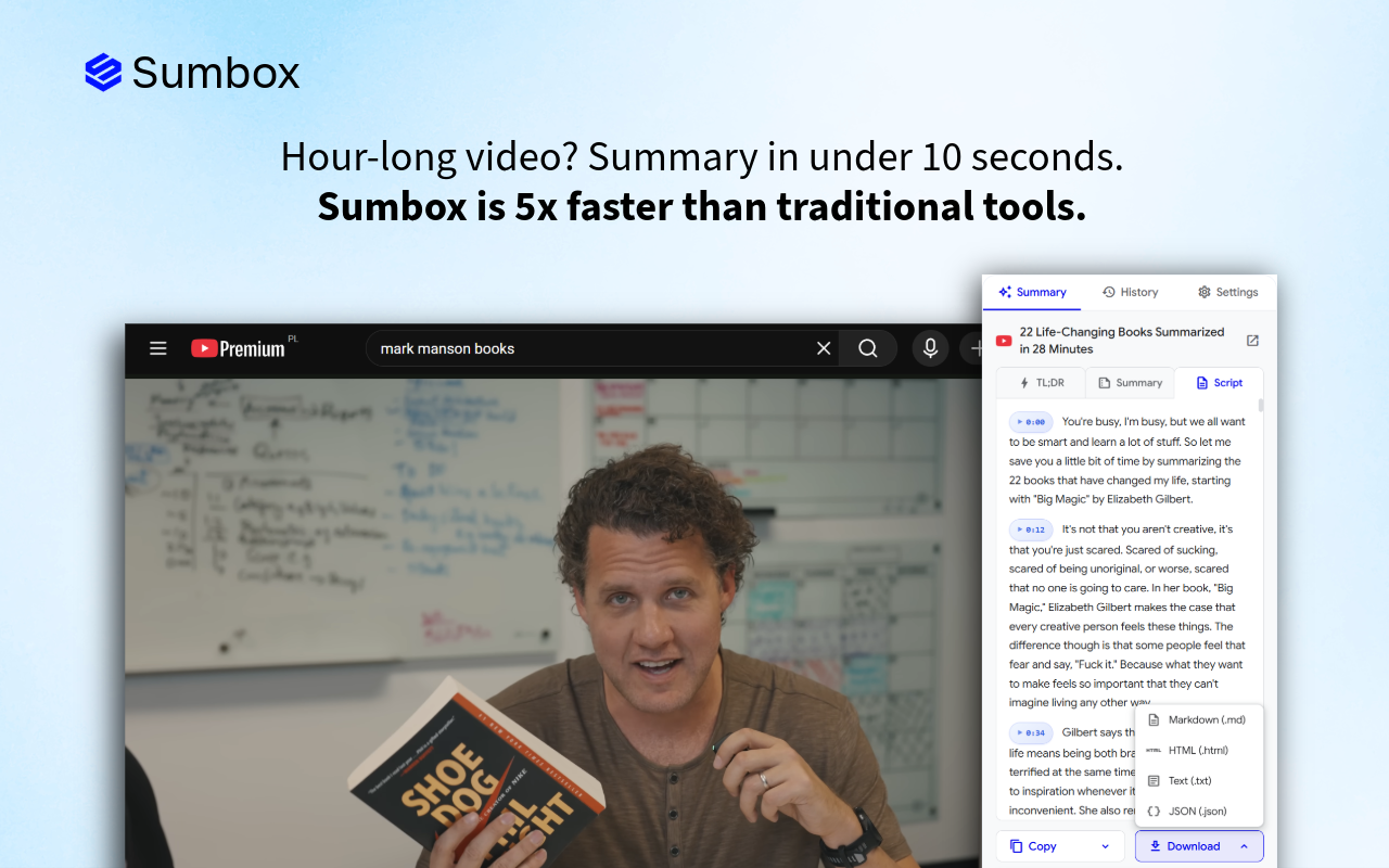
Screenshot 1: Hero shot Show your extension in action on a real website. This should immediately communicate the core value proposition.

Example: If you have a summarization extension, show it summarizing a popular YouTube video or news article.
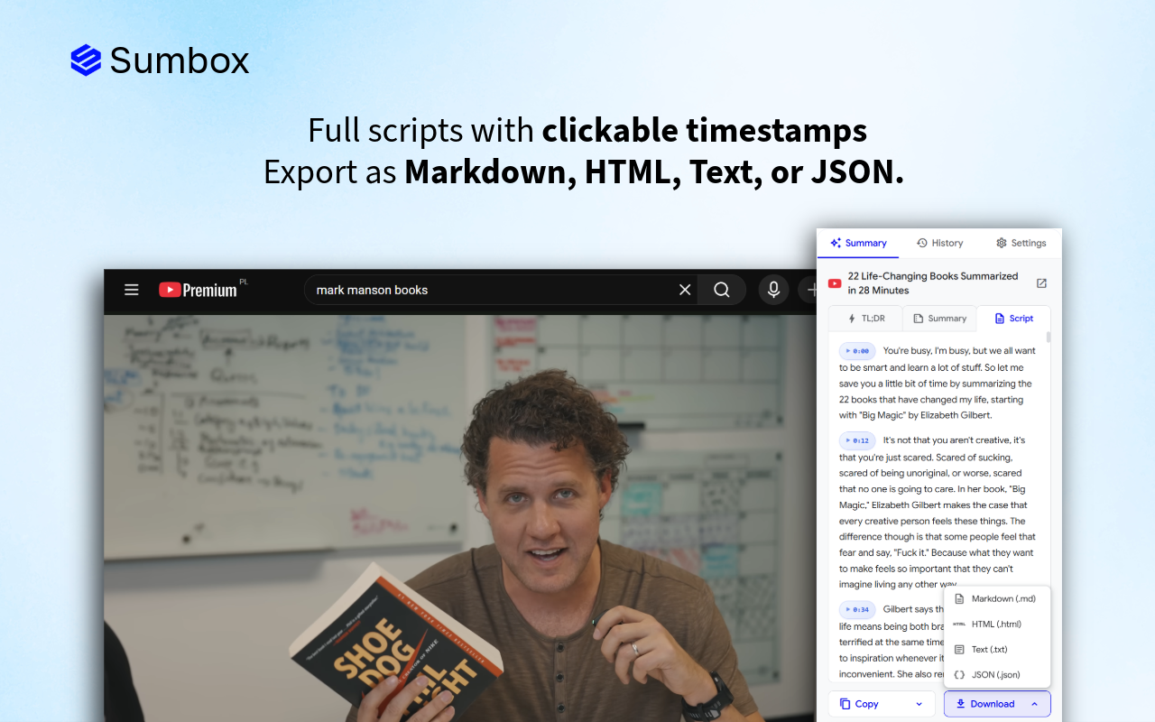
Screenshot 2: Key feature Highlight your most impressive or unique feature.
Example: Show the different output sections, export options, or language settings.
Screenshot 3: User interface Give users a clear look at your extension's interface – the popup, side panel, or settings page.
Screenshot 4: Before/after or problem/solution Show the problem your extension solves alongside the solution.
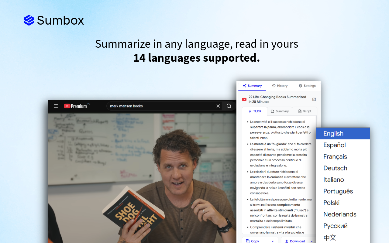
Screenshot 5: Additional features Showcase secondary features, integrations, or customization options.
Design tips
Do:
- Add context with subtle annotations or callouts
- Use consistent styling across all screenshots
- Show real content (not lorem ipsum)
- Highlight the UI with subtle shadows or device frames
- Include captions or headlines on each screenshot
Don't:
- Use tiny text that's unreadable
- Show cluttered or confusing interfaces
- Include personal or sensitive information
- Use low-resolution or blurry images
Copy for screenshots
Each screenshot should include a brief headline. Keep it to 5–8 words maximum:
- "Summarize any video in one click"
- "Get key insights in seconds"
- "Export to Markdown, HTML, or PDF"
- "Works in 14+ languages"
- "Beautiful dark mode included"
Position text at the top or bottom of the screenshot, not over the main UI.
3. Small promotional tile
This is the most commonly displayed promotional image. It appears in:
- Search results
- Category pages
- "Related extensions" sections
- The main store listing
Dimensions
440×280 pixels (PNG or JPEG, no transparency)
What to include
This is your billboard. It needs to work hard in a small space.
Essential elements:
- Your logo/icon – Top left or centered
- A headline – Your value proposition in 5–7 words
- A visual – Screenshot, illustration, or product mockup
- Brand colors – Consistent with your icon and extension
Copy examples
Headline options:
- "Summarize YouTube videos instantly"
- "Save hours reading articles"
- "AI-powered content summaries"
- "Get the key points in seconds"
Optional subheadline (if space permits):
- "TL;DR for any video or article"
- "Free 7-day trial"
- "Trusted by 10,000+ users"
Design tips
- Use high contrast so text is readable at small sizes
- Don't overcrowd – whitespace is your friend
- Test legibility by viewing the image at 50% zoom
- Avoid putting important content at the edges (they may get cropped in some views)
Layout suggestion
SUMMARIZE ANY VIDEO
IN ONE CLICK
4. Large promotional tile (DEPRECATED)
According to the Chrome Web Store documentation, the 920×680 Large promo tile is no longer used. It was previously used for category highlights, but the current Chrome Store UI doesn't display it anymore.
5. Marquee promotional tile
This wide banner appears when your extension is featured prominently at the top of the Chrome Web Store homepage or category pages. It's premium real estate.
Dimensions
1400×560 pixels (PNG or JPEG)
What to include
This is your chance to make a big impression:
- Bold headline – Large, attention-grabbing text
- Subheadline – Supporting message
- Hero visual – Large, detailed screenshot or mockup
- Logo – Clearly visible but not dominant
- Call-to-action feel – The design should make users want to click

Copy examples
Headline: "Stop wasting time on long videos"
Subheadline: "Get AI-powered summaries of any YouTube video or article in seconds"
Design tips
- Think of this as a web banner ad
- The wide format works well with a horizontal layout: text on one side, visual on the other
- Use dramatic, high-quality visuals
- Ensure text is large enough to read at a glance
- Test on different screen sizes
Layout suggestion
STOP WASTING TIME
ON LONG VIDEOS
AI-powered summaries in seconds
Design best practices across all images
Brand consistency
Use the same:
- Colors – Pick 2–3 brand colors and stick to them
- Fonts – Use one headline font and one body font maximum
- Style – If one image uses flat design, they all should
- Tone – Professional, playful, minimal – pick one and commit
Typography
- Headlines: Bold, sans-serif fonts work best (Inter, Roboto, SF Pro, Montserrat)
- Minimum font size: 24px for small tile headlines, 16px for body text
- Contrast: Ensure text passes accessibility contrast ratios (4.5:1 minimum)
Color
- Use your brand's primary color as an accent
- Ensure sufficient contrast between text and background
- Test how images look in both light and dark contexts
- Avoid pure black (#000000) – use softer darks like #1a1a2e
Screenshots
When capturing screenshots:
- Use a clean browser profile (no personal bookmarks or extensions visible)
- Set browser zoom to 100%
- Use realistic, relatable content in the screenshot
- Consider using a browser frame mockup for context
- Highlight key UI elements with subtle annotations
Free Adobe Express template
To make this entire process easier, I've created an Adobe Express template with all five image sizes pre-configured:
Get my Chrome Web Store image template for Adobe Express
The template includes:
- Small promo tile (440×280)
- Marquee promo tile (1400×560)
- Placeholder layouts with guides
- Easy-to-edit text and image areas
Simply duplicate the template, swap in your colors, logo, and screenshots, and export.
Quick reference checklist
Before submitting to the Chrome Web Store, ensure you have:
Common mistakes to avoid
- Text too small – If you can't read it at 50% zoom, it's too small
- Cluttered design – Whitespace is essential; don't fill every corner
- Inconsistent branding – Your icon, screenshots, and promo tiles should feel like a family
- Low-resolution images – Blurry images signal low-quality extension
- Misleading screenshots – Show your actual UI, not mockups of features you don't have
- Ignoring the marquee tile – You might miss out on featured placement
- Using copyrighted content – Don't include other brands' logos or copyrighted images in screenshots
Final thoughts
Your Chrome Web Store images are a one-time investment that pays dividends with every store visitor. Take the time to create polished, professional assets that accurately represent your extension.
Remember: users judge your extension's quality by its presentation. A beautiful store listing suggests a well-crafted product. A sloppy one raises red flags.
Use the Adobe Express template to get started quickly, and don't hesitate to iterate on your designs based on user feedback and conversion data.
Good luck with your Chrome extension! 🚀


